This is an update to the previous published articles on Data Visualization, OData Feeds, Power Map, Power Pivot in Office 2013 and Power Pivot in Office 2010. It shows how to use Power BI for Desktop to create a Sales Dashboard for Dynamics AX 2012 (R2).
Get Data
Start Power BI for Desktop and start with an empty report. From the ribbon on top click “Get Data”, choose SQ Server and provide your server and database. In this example I’m using a single server installation. However, in a production environment you might need to provide <SERVERNAME> <INSTANCENAME> , <PORT> e.g. SRVSQLPROD,2303.
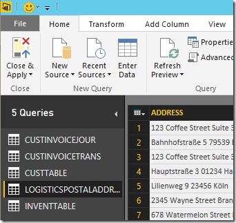
In the next step you have to provide credentials. In my case I’m allowed to access the server with my domain account. In a production environment it is recommended to create a separate Login which is only used for BI Purpose. Don’t get confused if you get a warning that your SQL does not support encryption. If the connection was established successfully, the data wizard presents you a list of tables. Select the following tables:
- CustInvoiceJour
- CustInvoiceTrans
- CustTable
- InventTable
- LogisticsPostalAddress
Click Load, and choose “Import” to load the data in Power BI for Desktop.
Transform Data
In Power BI for Desktop, at the Ribbon click “Edit Queries”. This will open the query editor. We don’t need all columns for this Demo. For each table click the “Choose Columns” button and the select only the following columns:
| CustInvoiceJour | CustInvoiceTrans | CustTable |
|
|
|
| InventTable | LogisticsPostalAddress | |
|
|
Click “Close & Apply” to finish this task.
Create Relations
In Power BI for Desktop switch to the Data View (with the table symbol on the left pane). It is required to create primary keys and foreign keys before linking the tables. From the list of tables (on the right) select the CustTable and at the Ribbon click “New Column”. Type the following definition:
PK_Cust = CUSTTABLE[ACCOUNTNUM] & “-” & CUSTTABLE[DATAAREAID]
This will create a new column with a customer account which is unique for all company accounts. Repeat this step for the following tables and columns:
InventTable:
PK_Item = INVENTTABLE[ITEMID] & “-” & INVENTTABLE[DATAAREAID]
CustTable:
PK_Cust = CUSTTABLE[ACCOUNTNUM] & “-” & CUSTTABLE[DATAAREAID]
CustInvoiceJour:
FK_Cust = CUSTINVOICEJOUR[INVOICEACCOUNT] & “-” & CUSTINVOICEJOUR[DATAAREAID]
PK_Invoice = CUSTINVOICEJOUR[INVOICEID] & “-” & CUSTINVOICEJOUR[SALESID] & “-” & CUSTINVOICEJOUR[NUMBERSEQUENCEGROUP] & “-” & CUSTINVOICEJOUR[DATAAREAID]
CustInvoiceTrans:
FK_Item = CUSTINVOICETRANS[ITEMID] & “-” & CUSTINVOICETRANS[DATAAREAID]
FK_Invoice = CUSTINVOICETRANS[INVOICEID] & “-” & CUSTINVOICETRANS[SALESID] & “-” & CUSTINVOICETRANS[NUMBERSEQUENCEGROUP] & “-” & CUSTINVOICETRANS[DATAAREAID]
Save, and open the relations by clicking on the relations item in the navigation pane on the left. You can drag&drop columns from one table to another table to create relations. Link the following columns:
- CustInvoiceTrans,FK_Item > InventTable.PK_Item
- CustInvoiceTrans.FK_Invoice > CustInvoiceJour.PK_Invoice
- CustInvoiceJour.FK_Cust > CustTable.PK_Cust
- CustInvoiceJour.InvoicePostalAddress > LogisticsPostalAddress.RecId
Your data model should look like this:
Name the ItemType
In the data view, select the InventTable. From the ribbon create a new column and name it “TypeName”. Add the following code to translate the Enum based ItemType Integer Value to a meaningful name.
TypeName = IF(INVENTTABLE[ITEMTYPE] = 0; “Item”; IF(INVENTTABLE[ITEMTYPE] = 2; “Service”; “Not an Item”))
The InventTable should look like this:
Create a Discount measure
Next we will create a measure which calculates the given discounts as the percentage of the total price. Open the data view using the second button on the left navigation pane. Select the CustInvoiceTrans. From the ribbon, click “New Measure” button in the “Modelling” tab. Provide the following code:
M_DiscPerc = sum(CUSTINVOICETRANS[SUMLINEDISCMST]) * 100 / ( sum(CUSTINVOICETRANS[LINEAMOUNTMST]) + sum(CUSTINVOICETRANS[SUMLINEDISCMST]))
For example:
Qty = 1 € , Unit Price = 1000 € –> Price = 1000 €
Discount = 100 € –> Price = 900
Discount Percentage 3 % –> Price = 873 €CustInvoiceTrans.LineAmountMST = 873
CustInvoiceTrans.Discount = 100
CustInvoiceTrans.LinePercent = 3.0
CustInvoiceTrans.SumLineDiscMST = 127M_DiscPerc = 127 * 100 / (873 + 127) = 12,7
Visualize
Switch to the empty report view using the first button on the left navigation pane. From the Visualization toolbox click the “Card”. This will place an empty card on the report. Drag&Drop the LineAmountMst from the CustInvoiceTrans on the empty card. It should look like this:
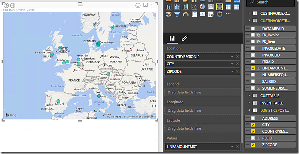
Next, place a map from the toolbox on the report. Drag&Drop the fields CountryRegionId, City and ZipCode from the LogisticsPostalAddress table on the Location. Drag&Drop the LineAmountMST from the CustInvoiceTrans on the Values Field. The map should look like this:
Add a new Gauge to the report and use the Measure M_DiscPerc as value. You cannot set a hardcoded Min. and Max. value in the data properties. Switch to the Format view using the pencil icon. In the group Gauge Axis, set the Min. Value 0, the target value to 3 and Max. Value 100. Depending on your data, the gauge may look like this:
Next a donut chart to visualize the revenue per item type. Drag&drop the LineAmountMST from the CustInvoiceJour on the value property of the donut chart and drag the TypeName from the InventTable.
Place a column chart on the report to visualize the revenue per customer group. Place the LineAmountMST in the Value field. Use the CustGroup from the CustTable as Axis. Change the sort order to LineAmountMST by using the […] Dropdown Menu in the upper right corner of the chart.
Finally, add a line chart on the report to visualize the revenue per year. Place the LineAmountMST from the CustInvoiceTrans on the charts value field and put the InvoiceDate from the CustInvoiceTrans on the Axis field.
Fine-tuning
Give each chart a meaningful name. Change the size for the text to fit your report style. Switch to the data view. Change the column names into something more meaningful for an end user e.g. LineAmountMST to Amount. Change the columns formats e.g. Currency for LineAmountMST, date format for the InvoiceDate.


